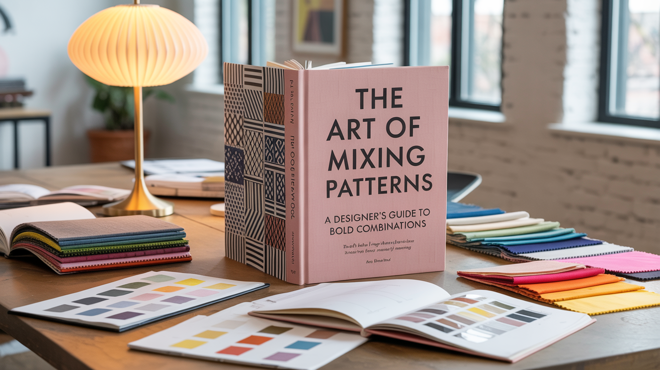
Master the sophisticated skill that separates confident decorators from timid beginners. Pattern mixing is one of the most powerful tools in interior design, but it requires understanding the rules before you can break them effectively.
Walk into any professionally designed space and you'll notice something that instantly elevates it above amateur attempts: fearless pattern mixing. While most homeowners play it safe with solid colors and maybe one "statement" pattern, designers layer stripes with florals, geometrics with paisleys, and bold prints with subtle textures in ways that look effortless but sophisticated. The secret isn't intuition or expensive training—it's understanding the underlying principles that make pattern combinations sing in harmony rather than clash in chaos. Once you master these rules, you'll have the confidence to create rooms with the depth, personality, and visual interest that only comes from skillful pattern mixing.
Every Pattern Has a Personality: Before you can successfully mix patterns, you need to understand what makes each one unique. Patterns aren't just decorative elements—they carry visual weight, emotional energy, and stylistic associations that affect how a room feels.
The Four Pattern Families:
The Scale Spectrum: Every pattern exists somewhere on the scale spectrum from micro (tiny dots) to large-scale (oversized botanicals). Understanding scale relationships is crucial for successful mixing.
Pattern Personality Assessment: Before combining any patterns, ask: Is this pattern busy or calm? Formal or casual? Traditional or contemporary? Patterns with similar personalities tend to work well together, even if they're visually different.
60% - The Foundation Pattern: This should be your most neutral, largest-scale pattern that can handle significant square footage without becoming overwhelming. Think subtle geometric wallpaper, large-scale textured fabrics, or quiet floral prints.
30% - The Supporting Player: Your secondary pattern should complement but not compete with the foundation. This might be throw pillows, curtain fabric, or upholstery on accent chairs.
10% - The Accent Punch: This is your boldest, most attention-grabbing pattern used sparingly for maximum impact. Think statement pillows, artwork, or a single dramatic piece.
Why This Works: This distribution creates visual hierarchy while preventing pattern overload. Your eye has a place to rest (the 60%) while being drawn to points of interest (the 10%).
The Three-Scale Rule
Large Scale (Foundation): Big, bold patterns that can anchor a room—oversized florals, large plaids, dramatic stripes with 4+ inch spacing.
Medium Scale (Bridge): Mid-sized patterns that connect large and small—classic florals, medium geometrics, traditional patterns with moderate repeat.
Small Scale (Detail): Tiny patterns that add texture and interest—mini dots, fine stripes, small geometrics, textural weaves.
The Magic Ratio: When mixing three patterns, vary the scale significantly. If your largest pattern has 12-inch motifs, your medium should have 4-6 inch elements, and your small should have 1-2 inch details.
Too Similar Scales: Using three patterns that are all medium-scale creates visual competition with no clear hierarchy.
Scale Jumping: Going from very large to very small with nothing in between creates jarring contrast without smooth transition.
Scale Monotony: Using all small-scale patterns makes rooms feel busy without impact, while all large-scale patterns overwhelm.
The Common Denominator Strategy
Share at Least One Color: The easiest way to make diverse patterns work together is ensuring they share at least one common color. This creates visual cohesion even when patterns are wildly different in style.
The 60% Rule Applied to Color: In your color palette, 60% should be neutral colors, 30% should be your main accent color (appearing in multiple patterns), and 10% should be your pop color for surprise and energy.
Color Temperature Harmony: Patterns with similar color temperatures (all warm or all cool) naturally harmonize better than mixing warm and cool randomly.
Tonal Mixing: Use patterns in different shades of the same color family—navy and powder blue stripes with medium blue florals creates sophisticated depth.
Analogous Adventures: Combine patterns using colors next to each other on the color wheel—blues, blue-greens, and greens create natural harmony.
Complementary Confidence: Pair patterns using opposite colors on the color wheel, but use one as the dominant color and the other as an accent—predominantly green botanical with orange accent flowers.
The Aesthetic Family System
Traditional Pairings: Florals + toile + classic stripes + paisley = timeless sophistication
Modern Combinations: Geometric prints + abstract patterns + clean stripes + minimalist florals = contemporary edge
Eclectic Mixing: Global patterns + vintage prints + artistic designs + textural patterns = curated worldliness
Transitional Balance: Simplified traditional patterns + modern geometrics + organic shapes = approachable sophistication
Cross-Style Success: You can mix style families, but one should dominate (60%) while others provide accent notes. A room that's 60% traditional with 30% modern and 10% eclectic reads as "traditional with contemporary touches."
Energy Level Coordination: High-energy patterns (bold stripes, busy florals, dynamic geometrics) work together, while calm patterns (subtle textures, quiet prints, soft geometrics) harmonize naturally.
Formality Alignment: Formal patterns (damask, toile, classic florals) pair beautifully with other formal patterns, while casual patterns (gingham, simple stripes, relaxed florals) create comfortable combinations.
Historical Period Awareness: Patterns from similar time periods often work well together—Art Deco geometrics with 1920s florals, or mid-century modern prints with atomic-age patterns.
Living Room: The Pattern Playground
Foundation Options:
Layering Strategy:
Pro Technique: Use odd numbers of patterned elements—3 different pillow patterns, 5 patterned accessories, 7 patterned items total. Odd numbers create more natural, pleasing arrangements.
Restful Approach: Bedrooms benefit from more subtle pattern mixing to maintain tranquility while adding interest.
Successful Combinations:
Scale Strategy: Keep large patterns away from the bed itself—use them in window treatments or accent wall wallpaper where they won't be overwhelming during rest.
High-Impact Opportunity: Dining rooms are perfect for bolder pattern mixing since they're used primarily during meals when people are seated and focused on conversation.
Statement Combinations:
Table Setting Integration: Consider how your china, linens, and serving pieces will work with your room's patterns. Simple dishes let room patterns shine; patterned dishes require simpler room backgrounds.
Practical Considerations: Kitchen patterns must withstand daily use and frequent cleaning while adding personality to functional spaces.
Smart Applications:
Maintenance Reality: Avoid very light-colored or high-maintenance patterns in areas prone to spills and heavy use.
Too Many Competing Patterns: More than 4-5 patterns in one space can create visual chaos. Stick to 3-4 well-chosen patterns for most rooms.
Ignoring Scale Relationships: All patterns of similar scale will compete for attention. Vary the sizes to create hierarchy.
Forgetting About Color Harmony: Even the most carefully chosen patterns will clash if their colors don't work together.
Overlooking Texture: Consider the texture of your patterns. Mixing smooth and textured patterns can add another layer of interest.
Not Testing in Context: Always view pattern combinations in the actual space with proper lighting before making final decisions.