Transform your home renovation from a simple aesthetic upgrade to a powerful tool for mental well-being. The colors you choose for your walls don't just change how your space looks—they fundamentally alter how you feel, think, and behave within it.
When you walk into a room painted in warm terracotta versus cool steel blue, your brain responds within milliseconds. Your heart rate might subtly shift, your stress levels could decrease, or your energy might spike—all before you consciously register the color. This isn't mystical thinking; it's science. Understanding color psychology can transform your upcoming renovation from a simple aesthetic upgrade into a strategic investment in your family's mental well-being.
Color psychology operates through multiple pathways in our brains. Evolutionary biology plays a role—we're naturally drawn to the blues and greens of safe water and fertile landscapes, while reds can trigger alertness from our ancestral need to spot danger or ripe fruit. Cultural associations layer on top of these primal responses, and personal experiences add another dimension entirely.
Research from the University of British Columbia found that blue environments enhance creative thinking by 42%, while red spaces boost attention to detail by 31%. These aren't small margins—they represent significant changes in how we think and feel in our daily lives.
The physiological impact is measurable too. Warm colors like red and orange can actually increase heart rate and blood pressure, while cool colors like blue and green have a calming effect on the nervous system. When you're choosing paint colors, you're essentially designing the emotional backdrop for thousands of hours of your family's life.
Red: The Energizer Red demands attention and stimulates conversation. It increases appetite (hence its popularity in restaurants) and can make people feel more energetic and passionate. However, too much red can increase anxiety and aggression. In homes, red works best as an accent color or in spaces where you want to encourage activity and social interaction.
Blue: The Calming Force Blue consistently ranks as the world's most popular color, and for good reason. It lowers blood pressure, reduces anxiety, and promotes feelings of tranquility. Lighter blues evoke openness and freedom, while deeper blues suggest stability and trust. The downside? Too much blue, especially darker shades, can feel cold or even depressing in spaces with limited natural light.
Green: Nature's Balance Green sits in the center of the visible spectrum, making it the most restful color for human eyes. It's associated with growth, harmony, and restoration. Studies show that green environments help people recover from stress more quickly and can even improve focus. It's particularly effective in spaces where you want to feel both energized and calm.
Yellow: The Mood Lifter Yellow stimulates mental activity and generates muscle energy. It's associated with happiness, optimism, and creativity. Light yellows can make rooms feel larger and more welcoming, but intense yellows can become overwhelming and may increase anxiety in some people. It's the color most likely to cause eye strain in large doses.
Purple: The Creative Catalyst Purple combines the energy of red with the calm of blue, creating a color that stimulates imagination and spiritual thinking. Lighter purples (lavenders) are soothing and romantic, while deeper purples convey luxury and sophistication. Purple can enhance creative thinking but might feel too stimulating for spaces meant for rest.
Neutral Colors: The Foundation Whites, grays, and beiges create calm, sophisticated environments that let other elements shine. They're psychologically "safe" colors that won't clash with changing moods or seasons. However, too much neutral can feel sterile or boring, lacking the emotional richness that color provides.
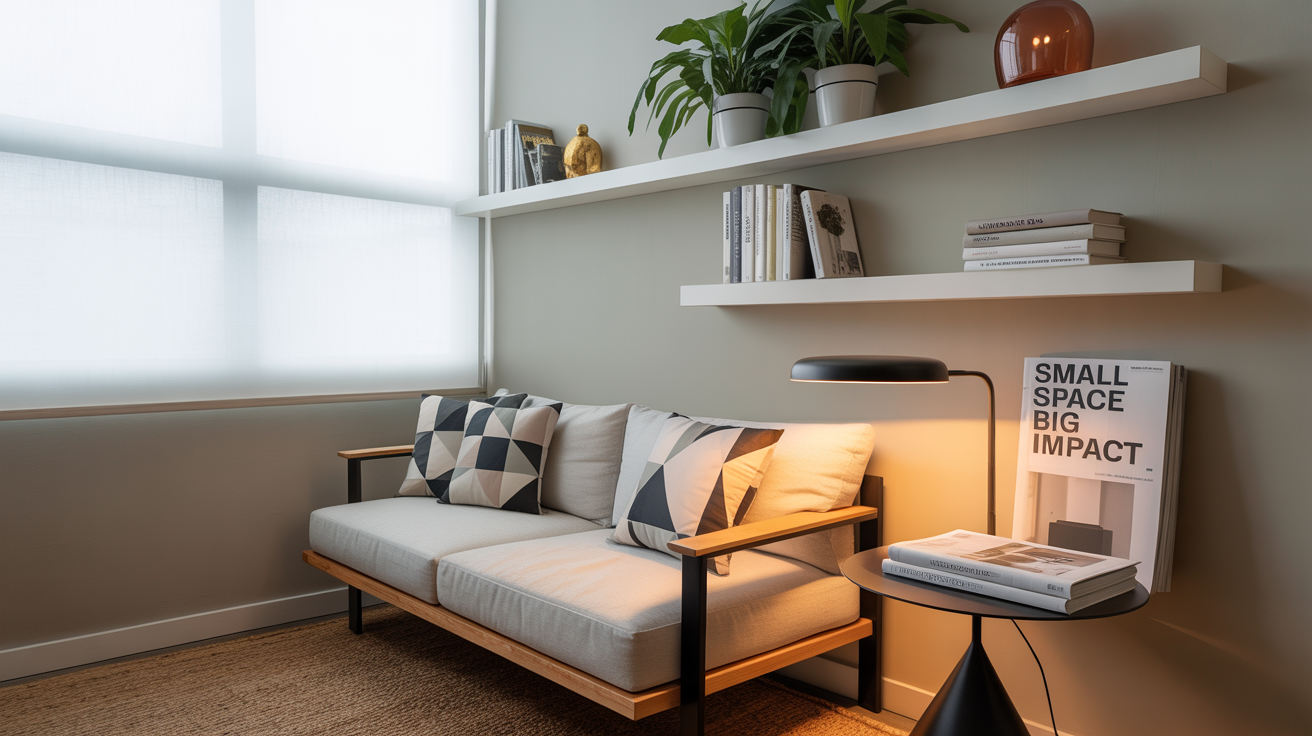
Living Room: The Social Hub
Your living room sets the tone for how guests feel and how your family interacts. Warm colors like soft oranges, warm grays, or sage greens create welcoming environments that encourage conversation. Consider using a feature wall in a bolder color while keeping other walls neutral to balance stimulation with comfort.
Strategic tip: If your living room serves multiple purposes (TV watching, reading, entertaining), use lighting to modify how colors appear throughout the day rather than choosing one color that serves all functions poorly.
Kitchen: The Heart of Activity
Kitchens benefit from colors that stimulate appetite and energy while remaining practical. Warm whites, soft yellows, and muted reds work well. Green can work beautifully in kitchens, especially sage or olive tones that connect to fresh herbs and natural ingredients.
Avoid: Pure white kitchens might look clean, but they can feel sterile and show every smudge. Cool blues might suppress appetite, though they can work well in kitchens where you're trying to encourage healthier eating habits.
Bedroom: The Restoration Zone
Your bedroom color should promote rest and intimacy. Cool blues, soft greens, and muted earth tones work best. If you want warmth, choose muted versions of warm colors rather than bright ones. The goal is to create a cocoon-like environment that signals to your brain that it's time to unwind.
Master bedroom strategy: Consider different colors for different walls. A soft blue or green for the wall you see when lying in bed, with warmer accent walls that you see when entering the room.
Home Office: The Productivity Space
Your office color should match your work style. Blue enhances creative thinking and is excellent for brainstorming spaces. Green provides balance and reduces eye strain, perfect for long computer sessions. If you need to maintain high energy and attention to detail, small amounts of red in artwork or accessories can help.
Hybrid spaces: If your office doubles as a bedroom or living space, use lighting and accessories to shift the mood rather than trying to find one color that serves both functions.
Children's Rooms: The Growth Environment
Children are more sensitive to color than adults. Bright colors can overstimulate, making bedtime routines more difficult. Soft, muted versions of their favorite colors work better than intense hues. Consider colors that will grow with them—a soft coral instead of hot pink, or a sage green instead of bright lime.
Practical approach: Use neutral wall colors and introduce personality through bedding, artwork, and accessories that can easily change as children grow.
Bathroom: The Refresh Space
Bathrooms should feel clean and refreshing. Light blues and greens work wonderfully, as do warm whites with good lighting. If your bathroom lacks natural light, avoid dark colors that will make the space feel smaller and more enclosed.
Consider your home's natural light. North-facing rooms receive cooler light and can handle warmer paint colors, while south-facing rooms get warm light and often benefit from cooler colors to balance the effect.
Test before committing. Paint large swatches (at least 2x2 feet) and observe them at different times of day. Colors can look dramatically different in morning versus evening light.
Think about color flow. You don't need matching colors throughout your home, but you should consider how colors in adjacent rooms work together. Use a consistent undertone (warm or cool) to create cohesion.
Account for existing elements. Your flooring, countertops, and fixed elements will influence how paint colors appear. Bring samples home and view them alongside your existing materials.
Consider the 60-30-10 rule. Use your main color for 60% of the room (walls), a secondary color for 30% (larger furniture, curtains), and a bold accent color for 10% (pillows, artwork, accessories).
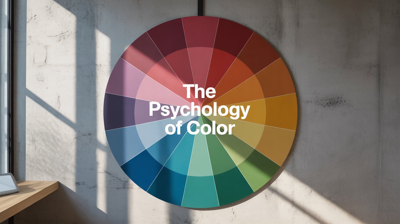
Single colors tell only part of the story. Color combinations create emotional complexity that can serve multiple functions within the same space. Complementary colors (opposites on the color wheel) create energy and visual interest, while analogous colors (neighbors on the color wheel) create harmony and calm.
For renovation planning, consider creating different zones within larger spaces using color. An open-plan living area might use warm colors in the seating area to encourage conversation, cooler colors in the reading nook to promote focus, and neutral colors in transition areas.
The most beautiful color scheme won't serve you well if it doesn't match how you actually live. Consider your family's routines, energy levels, and preferences. A high-energy family might thrive with warm, stimulating colors that would overwhelm someone who needs their home to be a calm retreat from a stressful job.
Think about the emotions you want to cultivate in each space. Do you want your dining room to encourage long, leisurely meals, or quick, energizing breakfasts? Do you want your bedroom to feel romantic and intimate, or clean and minimalist? Your color choices should support these goals.
Bottom Line: Your paint choices are creating an emotional environment that will influence your family's mood, productivity, and well-being for years to come. By understanding color psychology and applying it thoughtfully to each room's function, you can create a home that doesn't just look beautiful—it actively supports the life you want to live.
Remember, the best color choice is one that makes you feel good in your space. Use color psychology as a guide, but trust your instincts and choose colors that resonate with your personal style and preferences. After all, you're the one who has to live with them every day.
Planning a renovation? Take photos of your spaces at different times of day before choosing colors. Understanding how natural light changes throughout the day in each room will help you make color choices that work beautifully from sunrise to sunset.